As I mentioned in my clean, minimalist Drupal themes article, I've been thinking about remodeling my website about living in Alaska (OneMansAlaska.com) to a much cleaner and lighter theme, and to that end, I've been browsing the internet, looking for clean, minimalist web design examples.
I really like some of these website design ideas, and in my copious spare time I'm trying to figure out how each one might work with the OneMansAlaska.com website.
Here's a quick look at these clean, minimalist website designs, with a few notes about each design.
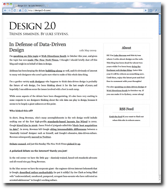
Clean minimalist, web designs - Design 2.0
What I like about the Design2-0.com website is that it is clean and simple, and there are no frills to get the reader sidetracked. I can easily see the title on the top, I'd add navigation links to the top-right, blog posts on the bottom left, and blocks on the right.
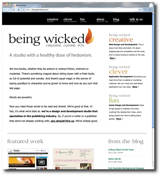
Clean website designs - Being Wicked
What stands out for me about the beingwicked.com website is the black border on the top for website navigation, and the white background on the bottom. Other than that, this design doesn't exactly fit what I have in mind for my OneMansAlaska website, but this is a nice, clean design.
Clean minimalist, web designs - Itchy Pixel
itchypixel.net may be my favorite "white background" design. Again, I can easily look at this site and think of how to adapt it to work on the Alaska website. If anything, I might subtract a few elements from their design, but I do like it a lot.
![]()
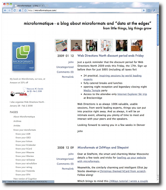
Clean website designs - Microformatique
The microformatique.com website is another clean, minimalist, white website design. I like that a lot of the design/layout is handled with whitespace and alignment. I can see putting the OneMansAlaska title in the top area of this page, recent/best photos in the area below that (on the right), and recent blog posts beneath that. Navigation blocks would go on the left. Again, this is a very clean, minimalist, website design.
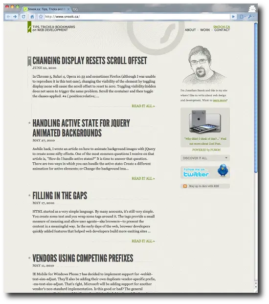
Clean web designs - snook.ca
At this point I'm thinking that I'll go with either a white or black background, because I think those colors alone help give the impression of a clean website design, but I do like the layout of the snook.ca website. Again, there are no visible lines, and the cleanliness of the layout is handled with alignment. Titles are large, dates are visible, and there's plenty of space between each blog post summary, and navigation links can be at the top-right, with navigation blocks along the right side of the page.
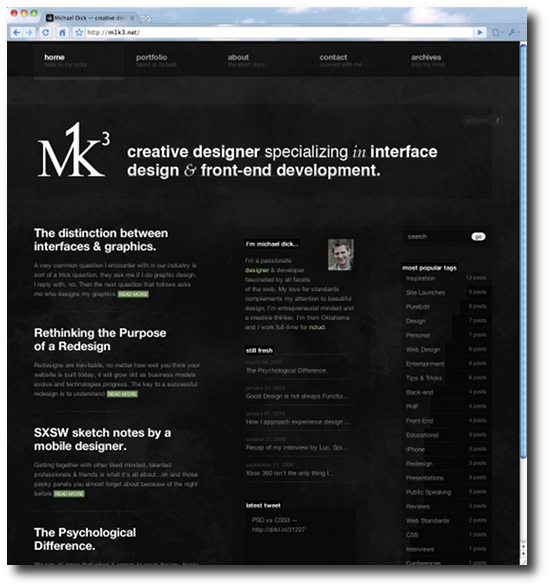
Clean minimalist, website designs - M1K3
Of all the "black background" websites I've seen, m1k3.net is the cleanest, most attractive, clean website design I have seen. If I go with a black background on the new OneMansAlaska website, it will probably look a lot like this website. I think a black background is the best way to show off photos, and I like that much of this website design/layout is handled with whitespace and alignment, along with the subtle texture of the background.
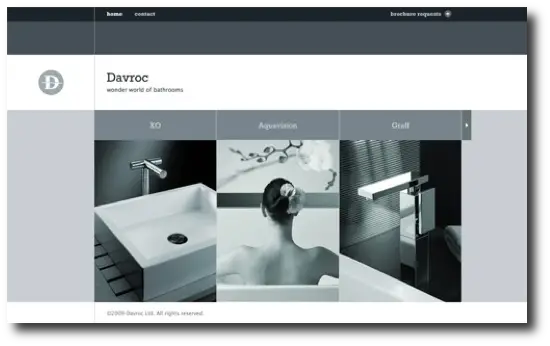
Davroc Interiors
In a Web 2.0 world where all corners are round, the Davroc Interiors website uses a rectangular design that begins with only grayscale tones until you hover over an image, when the image seems to come alive in color:
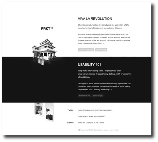
FRKT
An older version of the FRKT website also began with only black and white tones, and very nice use of alignment:
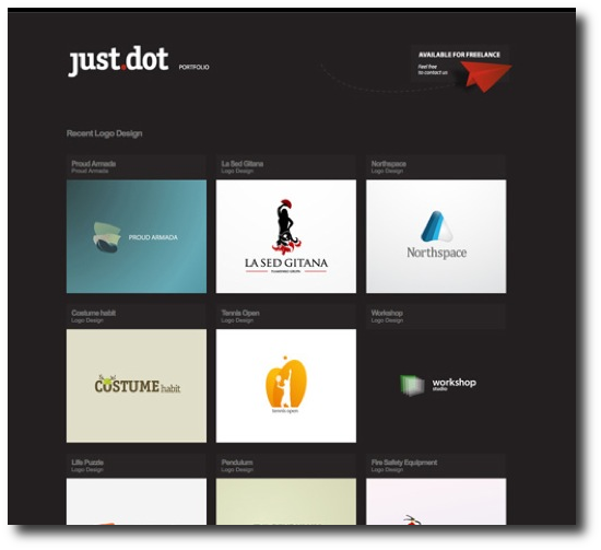
Justdot
An older version of the just.dot website also featured a very clean, simple design. This design would be good for a portfolio or photographs page:
Pixelcraft
An earlier version of the pixelcraft website also featured a clean, simple design. With the fonts it tends to look a little older, but the general layout is very good.
![]()
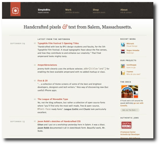
SimpleBits
An older version of the SimpleBits website also featured a clean, minimalist design. The simple navigation at the top tells you what the designer wants you to see (and be able to find):
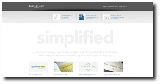
Daniel Collins
The Daniel Collins Design website is a very attractive, clean website. My only concern here is that I think the company name is "simplified":
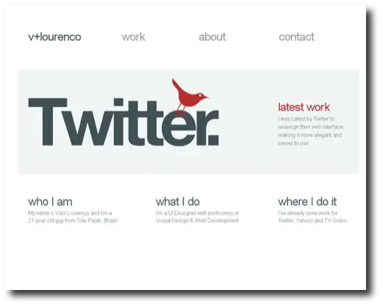
Vitor Lourenco
Finally, an earlier design of the Vitor Lourenco website was very clean. Just eight big links on this page makes it easy to navigate:
Clean, minimalist Drupal themes
As a final note, if you happen to be using Drupal, and are interested in clean Drupal themes, check out my new clean, minimalist Drupal themes collection.
My Alaska website redesign
With these minimalist website design examples in mind, I set out to redesign my website about living in Alaska yesterday, and ended up with this new design:
There are still some more changes I want to make to it, but not being a designer myself, I'm pretty happy with it. I also welcome constructive comments to help make it better.
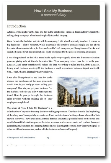
How I Sold My Business
I also design my How I Sold My Business website (HowISoldMyBusiness.com), and intentionally tried to create something that looked like an e-reader application. I added the horizontal line at the bottom to give the reader an idea of their location within the book. I'd like to do something different with the header, and my "up" link in the footer should be centered, but I'm happy with everything else about this design.
books by alvin
 |
 |
 |
 |