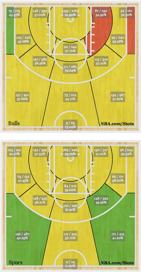
These images show the Chicago Bulls shooting ‘hot zones’ (top image) compared to the same data for the World Champion San Antonio Spurs. I wish the NBA had used a few more colors rather than a blanket yellowish color for many data points, but if you look at the actual data, you’ll see why the Bulls struggle offensively.
I don’t like the use of colors, but the website I’m about to link to states that yellow is comparable to the league average in that zone, green is better than average, and red is below the league average in that zone. But if you look at the shooting percentages right at the hoop, the Spurs shot 59.7% while the Bulls shot only 51.9% -- a huge 7.8% difference -- and both are colored yellow.
The Bulls’ chart comes from this url, and you can find the Spurs’ chart on the same website.