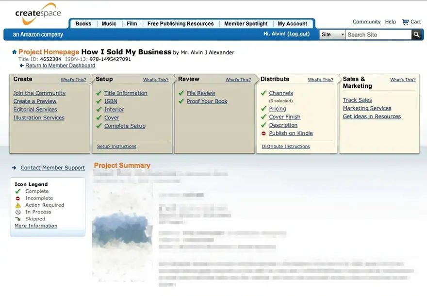
I’m currently working on getting two new books printed, and as I was working with the Create Space UI today, it occurred to me that I like their UI. It’s a simple, Web 1.0 UI, but everything is fairly simple, obvious, and easy to understand. The simple overlap of the rectangles shows that there is an order/flow to the way things need to be done, and they also show the status of each task. I even like that they have an “Icon Legend” on the screen. As a part-time designer and minimalist I’d like to get rid of the underlines under the hyperlinks, but in general I don’t have any huge problems with their UI.
(By contrast, if you’ve tried to use Yahoo’s webmail product during the last few months, you can see a horrible Web 2.0 UI. The designers/engineers try to do too many things, none of them well.)