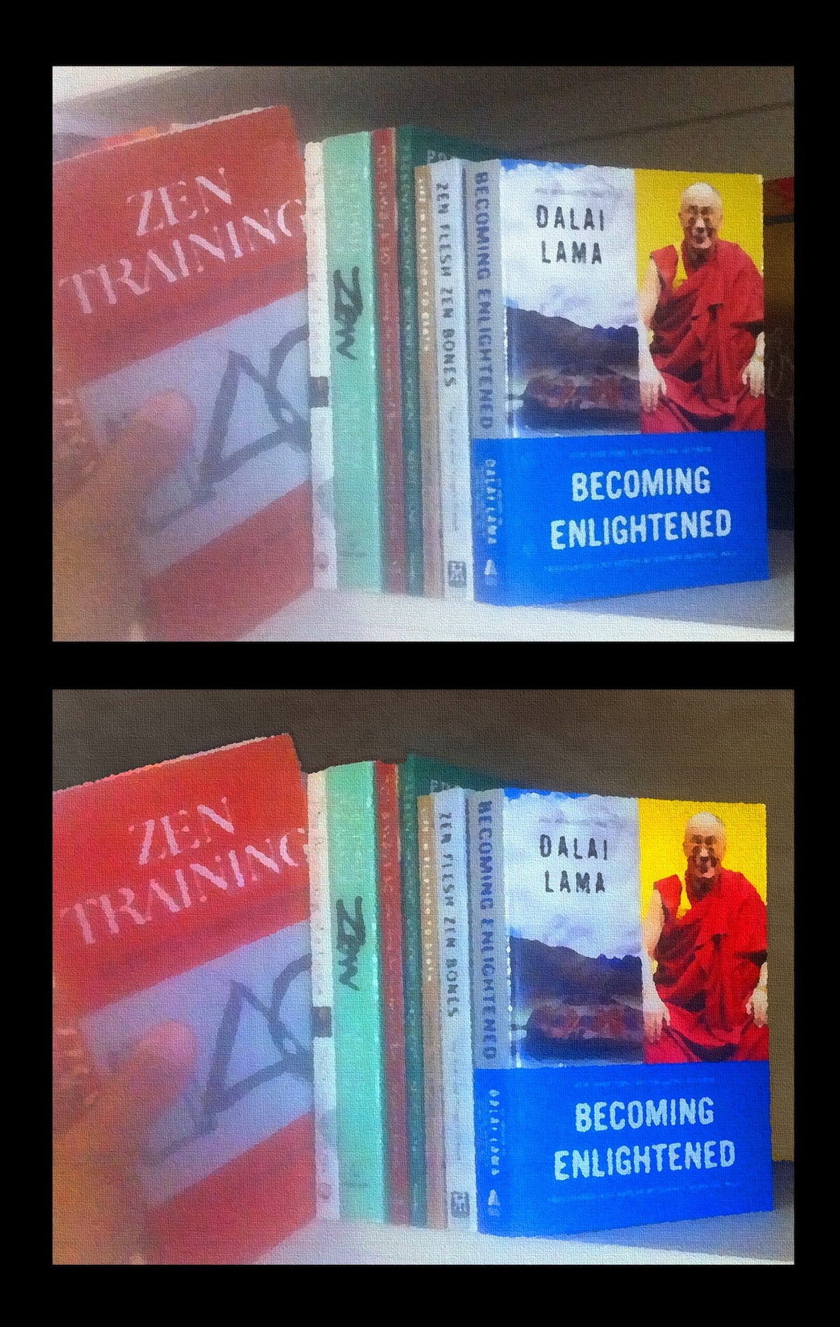
This photo shows two attempts at creating images for my next Zen Foundation postcard. The first image represents my first “final” attempt. In this case I knew I wasn’t blown away by the image, but it was the best I could do that night. I posted it on Facebook, got some feedback from a friend, and eventually came up with the second image, which is what I decided to go with.
(Click the image to see a much larger version of it.)
FWIW, if you’d like to receive this postcard in the mail, send me your address via my contact form, letting me know that you want to receive the Zen Foundation postcard, and I’ll add you to the mailing list.
Creating an “Oilify” image from a photo with Gimp
The original image I started with was a photo of my hand taking the Zen Training book off a bookshelf. This is a small version of the original photo:

If you use the Gimp, and are interested in how I got from that photo to the second image, here are my abridged notes on the process:
- I started with the photo, which was about 2,500 pixels wide.
- I rotated the photo slightly counter-clockwise.
- I kept cropping the photo until I got what I wanted. Unfortunately I had to crop out the Zen Speaks book, which is one of my favorite books. To work with Vistaprint I needed an image that was 1,677 pixels by 1,300.
- I cleaned up some "blotchy" issues on the books. (The lines on the Zen Training book, and some dots on the Becoming Enlightened book.)
- I did a lot of work in the background areas above and behind the books. I wanted to rework/remove that area because I thought it was an unnecessary distraction. I copied and pasted some of the best areas throughout the area, then used the Smudge Tool to even out the colors.
- I added a Fog filter (Filters > Render > Clouds > Fog) to only the background area behind and above the books. I did this by selecting that area with the Lasso tool, then applying a Fog to only that area. The Fog foreground color was white; I set the transparency very low, maybe 10-20%; and the turbulence was set high, probably to about 7.
- At this point I *may* have jacked up the colors with the Hue/Saturation color tool. (I may have also done this later, or both; I don't remember for sure.) I cranked the saturation up to the 30-40 range, while moving the lightness to -15 or so.
- I blurred the picture a little with the Pixelize filter, set at 4 or 5.
- I used the Oilify filter at settings of 13 and 14.
- I used Oilify even more on the left side of the image. To do this I used the Selection tool, then Oilified only that area. (It seemed like Oilify affected Becoming Enlightened much more than Zen Training, that's why I did this multiple times.)
- Because I wanted the Canvas background lines to appear larger than normal, I shrank the image from a width of 1,677 down to 1,000 pixels.
- I applied a Canvas to the image with a setting of 2.
- I brought the image back to 1,677 pixels wide.
- I tweaked the colors a little more.
Regarding the Canvas tool, I find that settings larger than 2 don't work well on large images; with a setting of 3, you can easily see the canvas being repeated as rectangular areas, and this gets worse at 4 and so on. I stumbled onto this trick of shrinking the image before applying the canvas completely by accident, but I like it because it makes the canvas gridlines larger than they would be otherwise. It messes with the image quality a little bit, but when going with this Oilify effect, I don't think it's a big deal.
Also, an easier way to handle the background area is to select the area with the Gimp Lasso tool, then fill it with a solid color. I'm sure that's what I'll do for the poster (and then add the Fog onto that).
Future changes
The second image isn’t perfect, but I hope it’s good enough for the postcards. In the future I’ll be reworking the image even more, and hope to make a poster from it. The second image looks great on my 24” iMac, so I’d like to think it will make a great poster of about that size.
I know I'd like even more of a Gimp “oilify” affect for the poster, so I’ll be tweaking the image even more before applying the oilify affect, making it more “pixelized” through one technique or another.