| Developer's Daily | Visual Cafe Education |
| front page | java | perl | unix | DevDirectory |
Introduction
TabPanel components are great for applets and applications where you want to present a lot of related information in a small amount of real estate. Look around the latest versions of Windows and Windows applications, and you'll see TabPanel components just about everywhere.
If there's an easier way to create a TabPanel in a Java applet/application
than with Visual Café's approach, I'd like to see it, because this
one is a knockout. Want to add and configure a TabPanel component
to an applet in less than five minutes? Go find that timer, because
we're about to get started.
Start your timer
Adding a TabPanel component is a quick and painless process with Visual
Café. In the next few steps, you'll see how to build the TabPanel
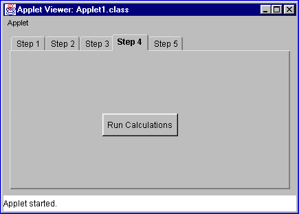
component shown in Figure 1.

| Figure 1: | A simple TabPanel component can be added to an applet very quickly. |
This TabPanel is similar to one I use in an applet named LottoBuster. In a nutshell, in five easy steps, LottoBuster helps users win the lottery. Okay -- creating a Tab Panel is probably easier than winning the lottery -- so let's concentrate on that for now.
Are you ready to create your five-minute TabPanel? Start your timer, and go:
The first step is to open Visual Café, and start a new project. To begin the process, start Visual Café, then select File | New Project , and then select Basic Applet from the New Project dialog. The Applet1 - Form Designer window should now be displayed on-screen.
Before adding the TabPanel component, let's make the background color of the applet light gray. Move to the Property List window, and change the Background property of Applet1 to lightGray.
While we're at it, let's change the layout of Applet1 to a BorderLayout. This will make the TabPanel component expand to the full Applet1 window size when we add it to the applet. In the Property List, select the Layout property, and change the layout to BorderLayout.
Now we'll add a TabPanel component to Applet1. The TabPanel component is in the Panels tab group of the Component Palette. Click on the Panels tab, then drag a TabPanel component from the Panels tab, dropping it anywhere onto Applet1. The TabPanel component instantly fills the Applet1 window.
Next, as shown in Figure 1, we'll want five separate tab groups in our TabPanel. A tab group is created in a TabPanel component by a panel component to the TabPanel. In our case, if we add five panel components to the original TabPanel, we'll create five tab groups.
We'll create our five tab groups by adding five KeyPressManagerPanel components to the TabPanel component. (Compared to other possible panels, I prefer the KeyPressManagerPanel, because it helps manage the user's keystrokes, such as the [Tab] key and others.)
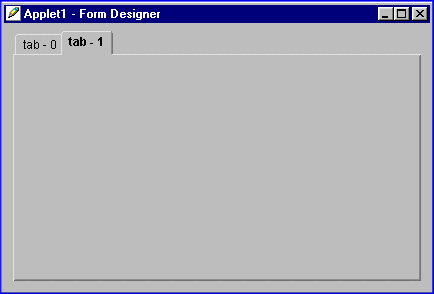
The KeyPressManagerPanel component is also in the Panels tab group of the Component Palette. To create the first tab group, drag a KeyPressManagerPanel component from the Panels tab group, and drop it onto the TabPanel in the Form Designer window. The location of the first KeyPressManagerPanel isn't too important - just drop it in the middle of the TabPanel. This creates the first tab group in your TabPanel component, and it should be labeled tab-0.
Creating the second TabPanel item is a little more tricky than creating
the first. This time, drag another KeyPressManagerPanel from the
Panels tab group, but this time drop it just to the right of the first
tab labeled tab-0. The trick is to drop the new KeyPressManagerPanel
onto the TabPanel component, making sure that you don't drop it inside
of the first tab group you just created. When you're successful at
doing this, a second tab element labeled tab-1 will appear
in your TabPanel element. This is shown in Figure 2.

| Figure 2: | Tab groups tab-0 and tab-1 are created by adding panels to the initial TabPanel component. |
Now you can finish creating the next three tabs groups in the same manner,
dropping each new KeyPressManagerPanel component just to the right of the
previous tab in the TabPanel component. When you're finished you
should have five tab groups in all, labeled tab-0 through
tab-4.
Changing the TabPanel labels
Changing the labels for each tab group is also pretty simple. To do this, switch to the Property List window, and select tabPanel1 in the choice component at the top of the window. Then, click the Tab Labels property, and type Step 1 in the list box. After typing this label, hit [Ctrl][Enter], then type the next label, hit [Ctrl][Enter], and so on until you're finished typing the five labels. At the end of the fifth label, hit [Enter] by itself to complete the process. The typing sequence in the Tab Labels text area looks like this:
Step 1 [Ctrl][Enter]When you've finished typing these labels and hit [Enter], the tab labels will be displayed on the tabPanel1 component.
Step 2 [Ctrl][Enter]
Step 3 [Ctrl][Enter]
Step 4 [Ctrl][Enter]
Step 5 [Enter]
First group first
If you think about it, when your applet starts running you'll want the
Step 1 tab group to be displayed first. To establish this
behavior, move to the Active Tab property in the Property List
window, and change the value to 0. This tells tabPanel1
to display tab group zero - labeled Step 1 - when the applet is
first displayed.
Adding a component to a tab group
Adding components to tab groups is also easy. For our applet we'll add a standard Button component to the tab group labeled Step 4.
Begin the process by clicking on the Step 4 label of the tabPanel1 component in the Form Designer window. When you do this, the tab group labeled Step 4 will move to the front of the other tab groups. Next, click on the Standard tab group in the Component Palette. Find the Button component in the Standard group, then drag it from the Standard group and drop it somewhere roughly in the middle of the Step 4 tab group. Actually, you're dropping it in the middle of the KeyPressManagerPanel component (probably keyPressManagerPanel4), which is inside of this tab group.
Change the label on this new button1 component by switching to the Property List window. Because you just added the component to the applet, button1 will be selected as the current component in the Property List window. Select the Label property, change the label to Run Calculations, and hit [Enter].
Because this string is too long for the width of the button, you'll need to move back to the Form Designer window and resize the button1 component. Resize the button by grabbing one of the corners of the button and making it wide enough to display the entire text.
Adding other components to the tabPanel1 component proceeds
in a similar manner. First, select the tab group that you want to
add the component to. Then grab the desired component and drop it
into the tab group. For more complex tab groups, you may want to
adjust the Layout property of the KeyPressManagerPanel inside of
each tab group. For instance, when adding a TextArea component
to the Step 5 tab group, I'll change the keyPressManagerPanel5
layout property to BorderLayout. When I do this, the new TextArea
component will expand to fit the entire height and width of that tab group.
Conclusion
Can you add a working TabPanel component to an applet or application
in five minutes? You bet! Try running the current applet and
testing it's behavior. You'll see that the TabPanel itself works
just fine, but the other inside components - like the button or text area
- require some programming help.
Copyright © 1998 DevDaily Interactive, Inc.
All Rights Reserved.