After looking at my website (alvinalexander.com) yesterday on my iPad, I thought maybe I should create a custom version of the website for mobile devices. However, after looking at the stats, it appears that there's a 10:1 ratio of stationary devices to mobile devices, which you can see in this graphic, courtesy of Google Analytics:
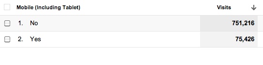
Even though there’s a 10:1 ratio of non-mobile to mobile users, I’m thinking about doing something else to accomodate mobile devices. Without doing any research yet, I don’t know if there's any easy way to use a different style sheet for mobile devices, but that’s my hope. (If I can’t do that, I’m hoping there’s a Drupal plugin to make this happen, though I’d rather not create an “m.alvinalexander.com” domain to make this happen.)
Mobile device breakdown
Regarding mobile device usage, here’s the breakdown Google Analytics gives me about mobile visitors of this website:
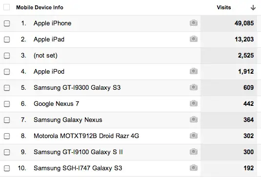
As you can see, the iPhone, iPad, and even the iPod dominate the mobile users who visit this website. Those numbers may be skewed because I write more about Apple devices than Android, although there are a ton of Java programming tutorials on this website, which should appeal to Android developers.
books by alvin
 |
 |
 |
 |