By Alvin Alexander. Last updated: June 4, 2016
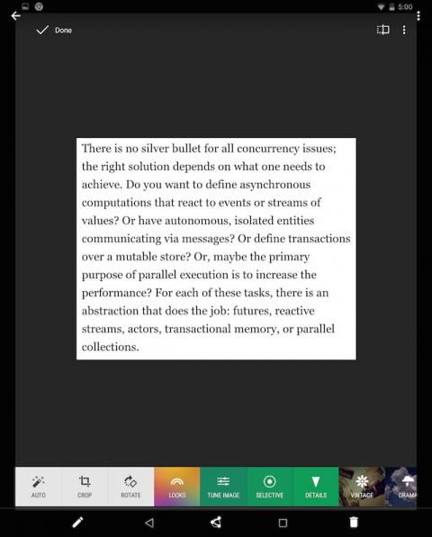
I’m just getting back into Android development after several years away, and I thought the Android standard was to have the tool icons on the top of each app window. However, I’ve seen several apps where the toolbar is on the bottom, including this large toolbar on the stock Android Photos app. (After some research, the Android docs show split action bars here.)
