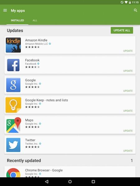
So I looked at my Nexus 9 screen two times about 45 minutes apart, and both times it showed that “Amazon Kindle” was updating itself. “WTF?,” I thought. “What’s taking so long, and why the heck is it updating itself anyway?”
So I double-tapped the update notification and it took me to ... well, some Android app. As you can see from the image, the app doesn’t have a name. The only way I could determine the name of the app was to press the square icon on the bottom toolbar to show all open apps and see that this app is named Google Play.
Personally, I think that’s poor design. If I can go to an (unknown) app from a notification, it sure would be nice if I had some clue as to what that app was. I know I’m exaggerating a little bit here, but I always think of non-techies in situations like this, and wonder how they get by with design like this.
