By Alvin Alexander. Last updated: June 4, 2016
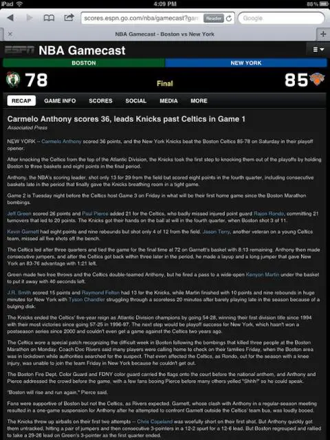
Some times to understand good design, you have to see examples of what not to do. I have no idea what ESPN is thinking with this dark background and small font when their content is displayed on an iPad.
