By Alvin Alexander. Last updated: June 4, 2016
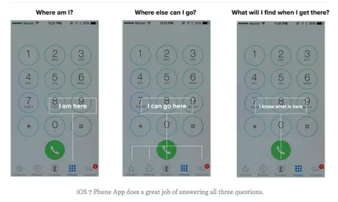
I don’t remember where I saw this image, I think it was on Twitter, but it points out three elements you need for good mobile design. Personally I wish the icons were a little better in iOS -- a little more obvious -- but the idea comes across in these three images. I think the word is “context,” humans need context when using mobile apps, or any apps.
