By Alvin Alexander. Last updated: June 4, 2016
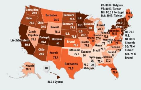
This image compares the life expectancy of states in the U.S. to other countries. At first I thought it was interesting, but the more I think about it, if the healthcare system in the U.S. is supposed to be so great -- as we’re often being told -- no other country should have the life expectancy of any of our states. I think we’re being fed some serious misinformation. (This map comes from this link.)
