I haven't designed or re-designed a website in about a year now, so I recently went through a fun — and hopefully interesting — exercise that I'd like to share here with a few words, but mostly images.
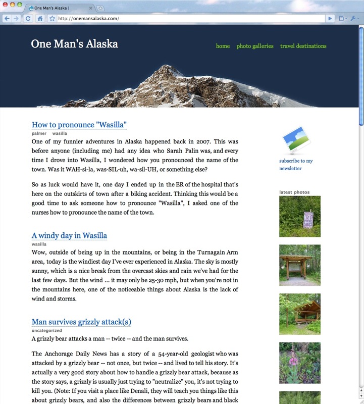
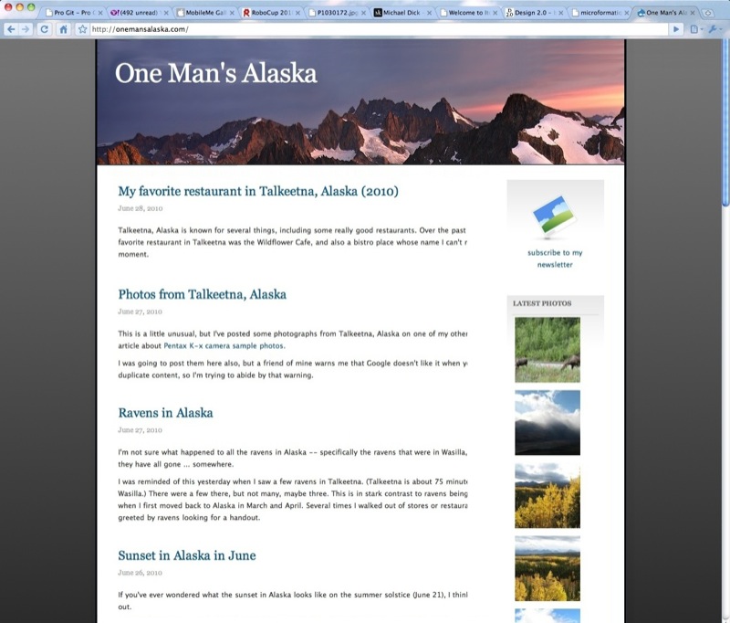
In the beginning, there was a website named One Man's Alaska (my blog about living in Alaska), and it looked like this:
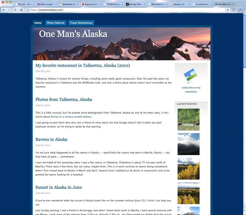
I was never totally blown away by this off-the-shelf Drupal theme, but it served the purpose of getting the site off the ground. Of course there are things I like about it, but things I didn't like included the dark background color which makes the site feel "heavy", the border around the content, the tabs on top, and the lack of alignment. But it included some nice, rotating header images, which was a clever idea.
I've been getting more into "design minimalism" lately, so I decided to take some time and try to strip this website down, and also make it feel much "lighter".
This page is sponsored by Valley Programming’s Boulder, Colorado programmer-analyst consulting services
want to sponsor a page? learn more.
Background changes
I tried to fix the "heavy" part of this theme by trying several different background colors with it, and finally settled on a gray gradient, with one version shown here:
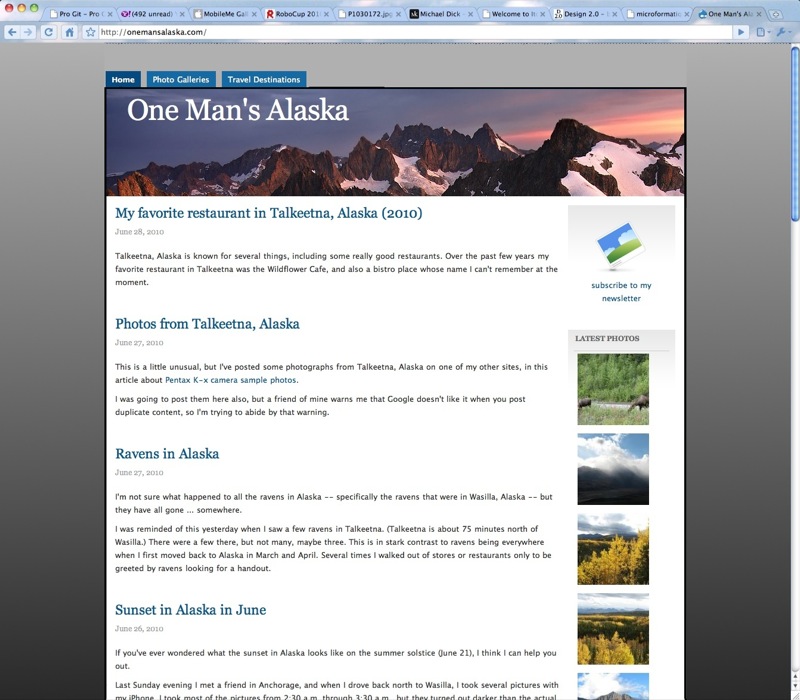
Even though it was gray, I thought it felt lighter than the original blue-striped background, and the gradient added a nicer feel than a flat background color.
Next, I knew I didn't like those tabs on the top, so I just deleted them without any regard for how I would add these navigation components back in. I also fixed some alignment and padding issues:
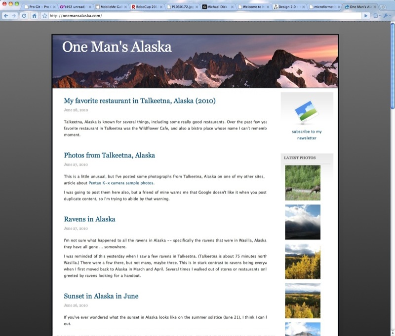
This was better, but I still didn't like the border, especially the wasted space at the top of the page; so I deleted it. I also decided that if the header image was going to stay, it needed to be taller:
A major, all-white website overhaul
Not sure where to go next, I spent some time studying clean, minimalist website design examples, and then looked at the best, clean Drupal themes I could find. This led me to scrap all this work, and go with a minimalist all-white website design, deleting everything but the required elements:
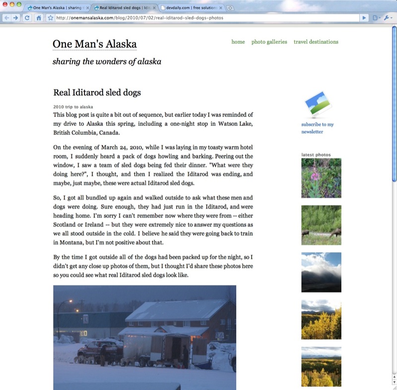
This design was based on the Drupal Austin theme, which I hacked to make it look like I wanted.
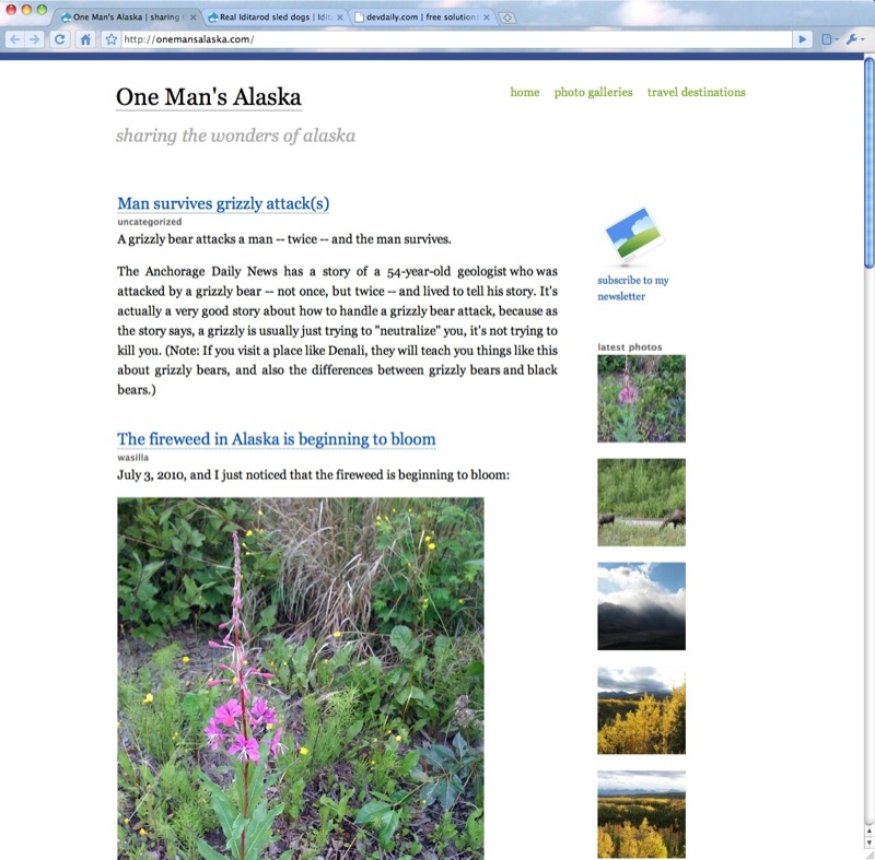
Now that I had a clean, minimalist, white Drupal design held together only by visual alignment, I decided ... I didn't like it.
While the page is much lighter and easier to read, Alaska is full of colors -- blues, greens, pink, red, etc. -- and I thought this all-white design was too simple, and didn't reflect what Alaska is like. I tried adding a simple blue pinstripe to the top, but it didn't help much:
Now that I had seen the all-white design and didn't like it, I thought adding a header back in might give the page some dramatic contrast. I fiddled around with headers for a little while, eventually trying a solid blue-ish header like this one:
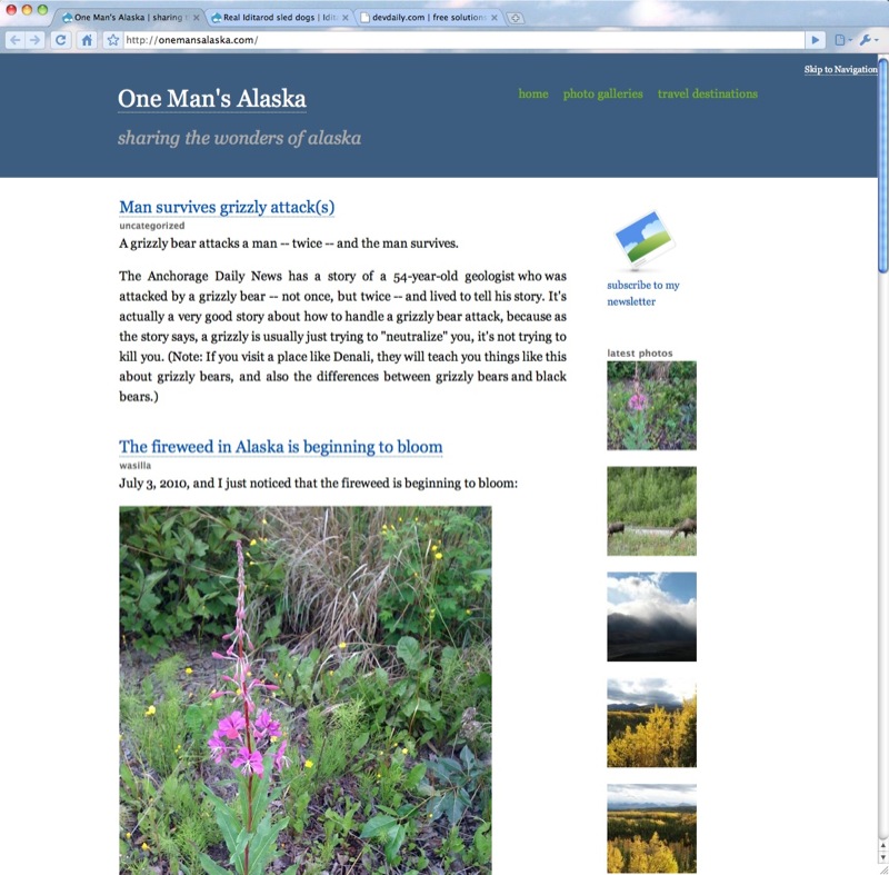
However, despite trying a zillion shades of blue for the header, I just didn't like it. Finally, I realized I had come full-circle, and it was time to put some great images in the header, just like I had when I first started. After some experimentation, I ended up with this header:
This is pretty much where the website design is today. (You can click that last image to see exactly what the website looks like today.) I just changed the links on the top of the page, and I still want to tweak a few more things, but this is pretty close to "final" for now.
General website design thoughts
I left the "Newsletter" link and column of images on the front page because I think these are important. The newsletter link lets people easily sign up for my newsletter, and the images help convey recent changes. I did try moving those blocks to the left side, but surprisingly I didn't like them over there, so I moved them back. I may change the column of images to a row of images that people can scroll through more easily, but that can wait.
I thought about changing the front page of the website to just show the most recent blog post, and then links to older posts, but I haven't done that yet. That would simplify the home page, but maybe too much so.
As I write this, I can see I missed one obvious thing: An RSS feed link. During the website redesign I kept saying to myself, "You need a checklist or you're going to forget things", and sure enough I did.
Drupal website redesign - summary
I hope this Drupal website redesign photo story has been helpful. During this whole process I kept bouncing back and forth between "Al the customer" and "Al the website designer", which was an interesting thought process. It also reminds me of the old acronym IKIWISI -- "I'll Know It When I See It". I used to go through this all the time with customers, and now I've done it with myself, lol.
