By Alvin Alexander. Last updated: February 18, 2018
These are my notes from the book, Jony Ive, The Genius Behind Apple’s Greatest Products, by Leander Kahney. They may not make sense if you haven’t read the book yourself, but they’re the notes from the book I want to remember.
Page 6:
- “I came to realize that what was really important was the care that was put into it. What I really despise is when I sense some carelessness in a product.”
- His father taught design, and took Jony on tours around London design studios and schools
- His father was a strong advocate of teaching empirically (making and testing) and of intuitive design (“get on and make it, refine as you go”)
- His father encouraged design teachers to manage the learning process by telling the “design story”
Page 22:
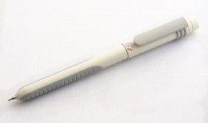
- In designing his famous TX2 white pen, he focused on the “fiddle factor”
- He observed that people fiddled with their pens all the time, and decided to give the pen’s owner something to fiddle with
- The pen’s design was not just about shape, but also that there was an emotional side to it
- The pen “immediately became the owner’s prized possession”
This is a photo of the TX2 pen:

Page 35:
- The nature of working as a consultant didn’t suit him. As an outside firm, RWG often had to make concessions to clients, something that would soon begin to drive Jony crazy. You end up with projects that are a compromise.
Page 75+:
- “What’s the story of this product?” (the design story)
- “The problem with the first Newton was that it didn’t relate to people’s everyday lives. It didn’t offer a metaphor that users could grasp.”
- To most people a lid is just a lid, but Jony gave it special attention. “It’s the first thing you see and the first thing you interact with. Before you can turn the product on, you must first open the lid. I wanted that moment to be special.”
- In this story, Jony was creating the Newton Lindy MessagePad 110, which won many design awards
- “To do the best design you have to live and breathe the product.” (Parsey)
- “Jony was frustrated because although he had worked really hard on it, he had to make a lot of compromises because of the engineering elements.”
Page 82:
- “We also want to be impressed with a designer to the point of intimidation.” (De Iuliis)
Page 90-91:
- Thanks to the metallic sheen, the bronze color had a chameleon-like effect that reflected the colors around it, helping it to blend into any room.” (Note: The latest designs from Nest use this same effect.)
- “every curve and detail has a purpose”
Page 97:
- “User experience is, ‘Here’s how people like to do things.’” (Mark Rolston, Frog)
Page 115+:
- “We didn’t start with engineering dictates, we actually started with people.”
- “The iMac revolved not around chip speed or market share but squishy questions like, ‘How do we want people to feel about it?’, and ’What parts of our mind should it occupy?’”
- Jony was looking for the Mac’s “design story”
- They discussed topics like, “objects that dispense positive emotions”
Page 119, 123:
- As Jony discovered in college, making detailed models was a key part of the design process. When you create a (3D) model, everything changes, you move from ‘nebulous’ to something more.
- Regarding the original iMac, “It came across as cheeky, that’s why we liked transparency.”
- “We had a taillight from a BMW, a lot of kitchen accessories, an old transparent thermos, cheap flatware for picnics...”
Page 127:
- “What Steve Jobs brought to the table was no compromise.” (Don Norman)
Page 151+:
- New owners would open and close the lid obsessively just to see the latch appear and disappear.
- The PowerBook’s magnetic latch was the kind of detail that turned a good product into a great one.
- It’s the artisanal details that count.
- “The decisive factor is fanatical care beyond the obvious stuff; the obsessive attention to details that are often overlooked.”
- In design, details like buttons and latches that make a design pop have a name: They’re called jewelry.
- “We really focused on the jewel pieces” (Satzger)
- Developed a concern for durability after some initial problems
Page 181+:
- The first iPod had to be created very fast
- The stainless steel back was a contentious choice; it looked great but was easily scratched and dented
- “It is actually a completely irrational use of that material in that context — but it absolutely worked.” (Lefteri)
- “Right from the very first time we were thinking about it, we’d seen it as stainless steel and white. It’s just so ... brutally simple.”
Page 220 (iPhone):
- As he later explained, it was all about how the user would feel about the device.
- “When we are at these early stages in design, when we’re trying to establish some of the primary goals — often we’ll talk about the story for the product — we’re talking about perception. We’re talking about how you feel about the product, not in a physical sense, but in a perceptual sense.”
- Jony believed the iPhone would be all about the screen. The designers agreed that nothing should detract from the screen, which Jony likened to an “infinity pool”.
Page 235 (iPad):
- Something bothered Jobs: Somehow the iPad wasn’t quite casual enough.
- Ive spotted the problem: The iPad needed a cue, some sign it was friendly and could be picked up easily with one hand.


