I'm sure this will sound strange to some people who know me, but I was happy to stumble on several Eclipse user interface design documents yesterday, including their UI Best Practices, User Interface Guidelines, and Top Ten Lists Working Page documents.
A few years ago, when I led a Swing rich client software development effort consisting of as many as eight developers at one time, and lasting for several years, I was given a lot of grief by the developers for creating a User Interface Guidelines document for that project. Believe me, I didn't want to go through that effort, but without a set of guidelines to refer to, our developers were all over the place, getting very "creative" with even the most simple dialogs. In short, there was no alignment anywhere, colors and fonts were all over the place, etc.
Although I knew the general principle before, it was on this project that this point was really hammered home to me:
Designers design, programmers program.
(Or, if you prefer, "Designers design, developers develop", or "Designers design, engineers engineer.")
I'm sure that comes across pretty harsh to some people, but as a general rule, that's the way software applications should be developed. Good designers are trained in design principles that most programmers either don't know, or only have a minor interest in.
Before you think I'm some crazy designer, I'm not. I'm an engineer. An aerospace engineer, to be precise.
I also started and sold a software company. And when it comes to the user interface of software applications, I've learned my lesson.
FWIW, this saying comes from a similar sports saying: "Coaches coach, players play." I remember when I first heard that saying I thought players should be able to give feedback to coaches, and I think the same thing is true here. Developers should obviously be able to give feedback to designers and interact with them, and hopefully they will collaborate on the final product, but in general, as long as the designer is competent, the final decision should be theirs.
My Wikistar editor
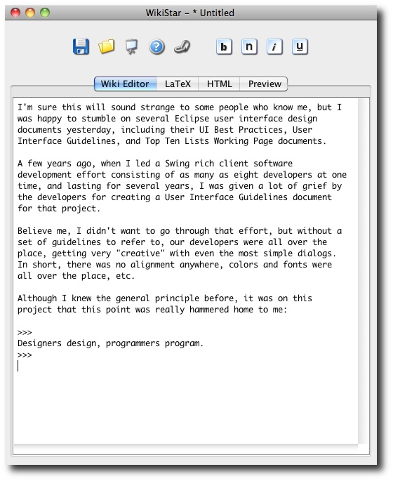
Personally I care quite a bit about what applications look like, and how they work. I call one app that I've written for myself Wikistar, which is a play on the very old app named Wordstar. In my case I use the name "Wiki" because I write text in one tab in a Wiki format, and then in other tabs I can see how that text is converted to HTML, LaTeX, and I can also see a browser preview of what I've written. Here's what the app looks like:

As mentioned, I'm no designer, but I try to keep things clean and simple. I've also made the most obvious tasks, well, obvious. Because I use this app personally every day, I care deeply about what it looks like and how it works.
Besides the obvious features, the third icon from the left hints at another feature: When I click that button, it hides the desktop, so that all I see is the app with a black background. That helps me focus on what I'm writing.
Links
Here's a collection of links to Eclipse UI design documents:


