The design of this website has been bothering me almost since I switched to it. The biggest problem was that all of the blocks I had on the side, especially the tall ad block, made the content hard to read.
So this weekend I finally took the time to change it, and Goal #1 was to make blog posts like this one easier to read. As a result, I switched to a simple (and somewhat drastic) approach of a one-column design.
Before and after
I forgot to take before and after photos, but fortunately I had an old version of the website open in a browser tab, so I took a picture of it. Here’s that “Before” image:
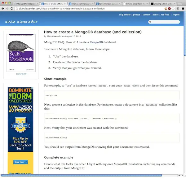
Things I didn’t like in this design included the distraction of the blocks in the left column, the header, the font in the source code area, and the fact that the content flowed horizontally to fill the screen width.
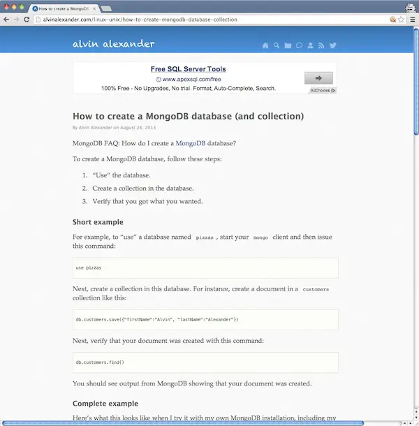
Next, here’s the “After” image of the same page with the new design:
Differences
As you can see, I changed a number of things:
- I removed the left column.
- I re-worked the header area, replacing the text with simple icons.
- The tall ads on the left have been changed by a smaller ad on the top.
Some things that are harder to see in these images:
- The new background isn’t a pure #fff white, it’s been toned down, and uses a subtle “noise” background image.
- The font in the PRE area has been changed.
- Some of the fonts, such as the “Submitted by Alvin” font have been changed.
- The spacing around the H2 tags has been changed.
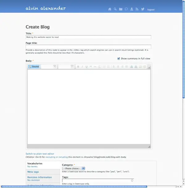
I doubt that most people (non-designers) will notice that the new background is off-white, but you can see it more clearly in this image, which is what I see when creating a new blog post:
What I lost in the redesign
Almost any design is a matter of tradeoffs, and the main thing I lost in this new design is the ability to advertise my books in the small block at the upper-left of the previous design. Honestly, I don’t know a good way to show those images in this new design, but readability is so important to me that I thought it was worth not showing those ads/images.
Another thing I lost was the obviousness of the “Categories”, which was also a block in the previous design. (You can’t see it in the “Before” image, but it was the block just below the tall ad.) With that design you could easily see that this site contains thousands of blog posts on topics like Scala, Java, Ruby, Linux, etc. That information is now hidden behind an icon in the header. However, my guess is that information wasn’t too important to visitors. When visitors come to a specific page on this site from Google or another website, I think they want to see (a) the content on that page, and (b) anything similar to that, which I show in the “Related” block below. (People generally aren’t going to jump from a Scala post to a Perl post by seeing the Perl category listed, for instance.) So this was a minor loss.
Design for yourself
I hope you like the new design, but honestly, I did this redesign for myself. I found those blocks distracting, I thought the old color contrast was too much, and I didn’t like the font in the source code areas. So I fixed them for myself, with the hope that other people will like the changes as well.
books by alvin
 |
 |
 |
 |