It may just be me, but since their last change, every time I try to read the Google News web page, it makes my head want to explode. For a company noted for testing over 40 shades of blue, I can't believe this was the best design they could come up with:
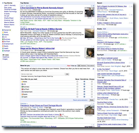
(about 1/3 of the Google News web page)
I'll take Google's mobile news, please
This point really hit home last night when I realized how much easier it is to read Google News on my iPhone (i.e., their mobile news page) than their regular news page, which, to me, just looks like a bunch of noise.
For grins, I just counted, and the Google News web page currently contains over 220 links. (By contrast, the web page you're looking at has about 55 links in seven discrete areas, and I'm trying hard to reduce that by half.)
Again, it may just be me, but that seems like an awful lot of links for a human to digest. Give me the Google News mobile web page any day.
books by alvin
 |
 |
 |
 |