Posts in the “design” category

How to create outlined text using Gimp

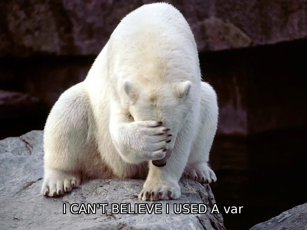
Here’s a quick look at how to create outlined text using Gimp. I don’t know if that’s the right term, but I’m thinking of the large white text you see with a black border that you usually see on meme images.

Here are the steps I just used:

  • Select the text you entered, such as, “I USED A var”. Make sure the Text Tool is active.
  • Click the “Path From Text” button in the Text Tool panel.
  • Click the Select menu, then “From Path”. You should see some action on screen here.
  • Create a transparent layer, move it below your text, and make it active.
  • Click Select, then Grow...
  • On the popup dialog, enter 3 pixels, 5 pixels, whatever you need for your font. When you click OK you should see the selection area on screen change size.
  • Click Edit menu, choose “Fill with BG Color”, or “Fill with FG Color”.

If you use a white font with a black background color, your image should look like this:
Yoda on Luke’s back (cartoonized with Gimp)

This is a cartoonize’d version of Yoda on Luke Skywalker’s back during Luke’s initial training in the swamp. To create it, I found the original movie image with a Google search, opened the image in Gimp, then worked back and forth with a Cartoonized plugin effect, the Beautify options, and the Artistic/Oilify effect. I can do a lot better than this, but for the purposes of this example, I created this cartoon image in less than five minutes. Given more time, I would clean up Yoda quite a bit before using the Cartoonize effect.

I’ve used Gimp to create almost 2,000 images that I use with the Mac screensaver “rotate images” feature, and this is the latest addition.

(Click the image to see the full-size, 1200x600 pixel image.)

How to make a rounded rectangle in GIMP

I recently needed to make an icon look like an iOS style app icon -- a rounded rectangle with transparent corners -- and to do that I needed to learn how to create a rounded rectangle in Gimp. This tutorial contains a short step-by-step description of how to do this.

Note: I’m writing this tutorial in April, 2015, using Gimp 2.8.

“Faster horses”

“If I had asked people what they wanted, they would have said, ‘Faster horses.’”

~ Henry Ford

I think of this quote when I see both good and bad design. Some people build/design faster horses, others invent cars.

A Luke Skywalker sketch

As I’ve mentioned before, I can’t see an image these days without wanting to do something with it in the Gimp. This is a Gimp “sketch” of Luke Skywalker from Star Wars movie #7. It would probably be better in plain black and white with a little less realism, but I have to get to work now. ;)

Good and bad design at Apple under Jonathan Ive

This medium.com article contains a fair balance of pointing out the good and bad of design at Apple under Jonathan Ive. Most people know the good parts, so this image shows a discussion of just two of the worst design decisions made by Apple’s design team. Other bad designs under Apple include pretty much every mouse ever made, the horribly infamous butterfly keyboards, and the trashcan Mac Pro design.

It seems like at some point every design quits thinking about what’s the best for the customer and succumbs to something that looks pretty. As the old saying goes, “Absolute power corrupts absolutely.”

Ferguson Jenkins, Chicago Cubs

Ferguson Jenkins was one of my favorite pitchers to watch when I was very young. Unlike other “throwers,” he was a true “pitcher,” getting by more by his control and changing speeds than having a blazing fastball. I created this “artistic” image of him pitching using Gimp.

The “Nanna teapot” (from Don Norman's Emotional Design)

It’s worth mentioning that my last post about a glass teapot was inspired by a book titled Emotional Design: Why We Love (or Hate) Everyday Things by Don Norman. In that book he shows this image of three teapots, and the glass one in the middle is known as a “Nanna teapot.” I just saw that one sold on eBay for $275; that’s a little more than I had in mind. :) Mr. Norman earlier published a best-selling book titled The Design of Everyday Things.

Good design: Quantity leads to quality (and iteration speed is vital)

When I saw this tweet this morning:

[DOG MAGICIAN] think of a color, any color ... is it ... gray?

[OTHER DOG] oh my GOD

I knew that I loved the joke, but I didn’t like the presentation. I wanted to put the joke on Facebook, but I know that people like images more than they like text, so I made a second cup of coffee and began putting the text on an image.

The first release of a product or service doesn’t have to be great

If you ever think you have to be perfect with a product or service in its first release, I encourage you to watch the Match Game tv series on Amazon Video. The first episodes of Match Game 73 were horrible; Gene Rayburn wasn’t comfortable, the writing was extremely poor, and all the celebrities (except for Jack Klugman) seemed uncomfortable. Then flash forward to Match Game 75 (or 78) and you’ll see a much better show.

For another example, take a look at the original iPhone and compare it to what’s available now. It was revolutionary, but it was also a minimum viable product.

How to paste text into the Gimp text tool (copy and paste)

At least on Mac OS X, if you want to copy text from one source and paste it into Gimp inside a Gimp text tool text region, you’ll find that this doesn’t work with the usual Control-V (Command-V on the Mac) keystroke. In short, the secret solution is to right-click inside the text tool area and select “Paste” from the popup menu. I have no idea why the normal copy and paste approach doesn’t work in Gimp, but I do know that this approach works, at least with Gimp 2.8 on Mac OS X.

If there is a beautiful view, don’t spoil it by building huge windows

An interesting theory about designing buildings:

“If there is a beautiful view, don’t spoil it by building huge windows that gape incessantly at it. Instead, put the windows which look onto the view at places of transition – along paths, in hallways, in entry ways, on stairs, between rooms.

If the view window is correctly placed, people will see a glimpse of the distant view as they come up to the window or pass it: but the view is never visible from the places where people stay.”

~ from A Pattern Language, by Christopher Alexander

There's a good story on this concept at this link.