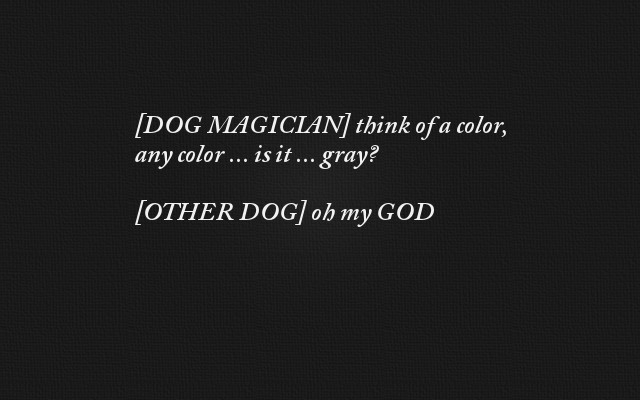
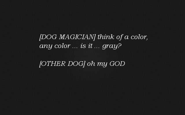
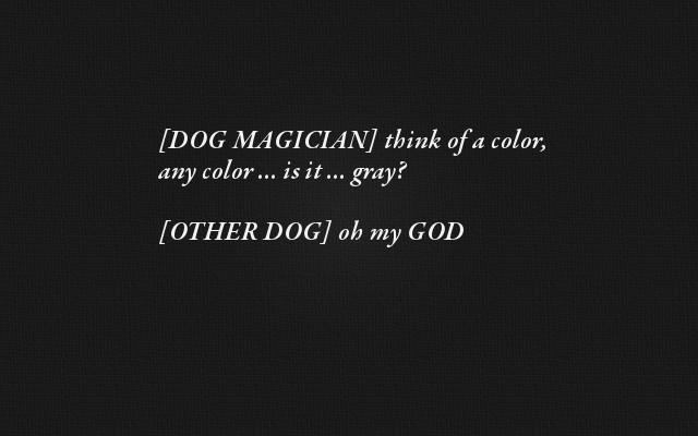
When I saw this tweet this morning:
[DOG MAGICIAN] think of a color, any color ... is it ... gray?
[OTHER DOG] oh my GOD
I knew that I loved the joke, but I didn’t like the presentation. I wanted to put the joke on Facebook, but I know that people like images more than they like text, so I made a second cup of coffee and began putting the text on an image.
To design something you like, create a million versions
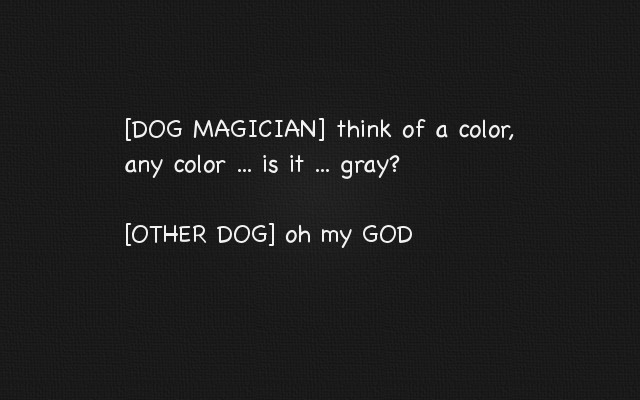
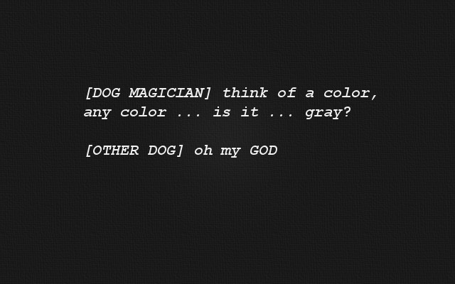
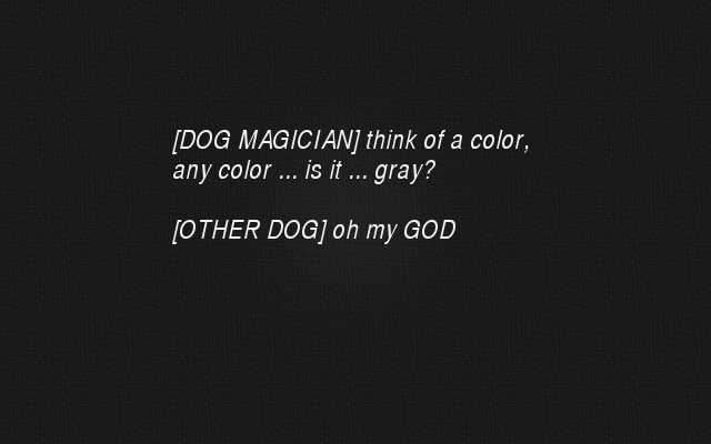
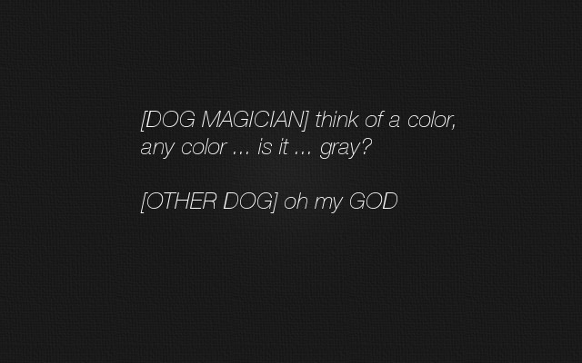
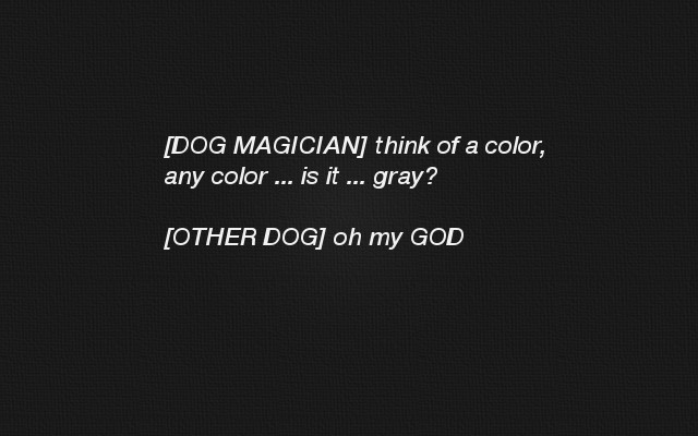
Second cup of coffee in hand, I fired up Gimp, created a dark background (because I thought that would look best on Facebook), typed in the joke, and began playing with the font. As you can see from the following images, I tried a lot of different fonts.
The actual images are actually about 1/3 larger than what I’m showing. I reduced the size here to make it easy to see several of them at a time. In case you’re curious about the fonts, I included the font name to the side of each image.
 (Adobe Carlson Pro)
 (Avenir Next Medium Italic)
 (Avenir Next Semi Bold Italic)
 (Baskerville Semi Bold Italic)
 (Bookman Old Style Light Italic)
 (Chalkboard)
 (Courier New Bold Italic)
 (Courier New Bold)
 (Garamond Premium Semi Bold Italic)
 (Helvetica CY Italic)
 (Helvetica Neue Light Italic)
 (Helvetica Neue Medium Italic)
 (Helvetica Neue Bright Italic)
 (Lucida Sans Italic)
 (Myriad Pro)
 (Trebuchet Italic)
For something like a Facebook post I would never make this many versions, but a repairman came to my apartment to work on my washing machine as I was working on this, and not wanting to start something else while he was here, I kept plugging away on these images.
As you can see, most of the images are not centered very well. I was just trying to get them into more or less the right ballpark, while focusing on what I thought of the font.
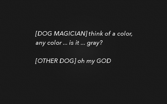
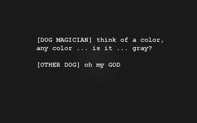
Decision: Lucida Sans Italic
Once I had all those different versions, I decided that I liked the “Lucida Sans Italic” version the best. As I look at them now in these smaller versions the Avenir and Trebuchet also look nice, but the original images are 640px wide, and I thought the Lucida looked best at that size. (Note: If this was important, I should have gone to Facebook and seen that they show their images at 488px wide (at least in a web browser), and focused on that size.)
That’s actually a good point about design:
Get up and walk away from the design for a while. What looks good while you’re working on a million different iterations may not look “best” after you walk away and look at the design later.
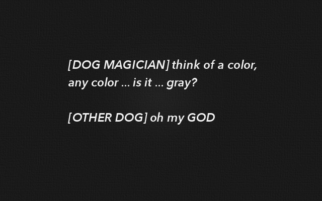
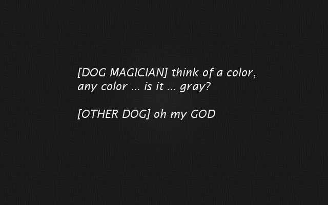
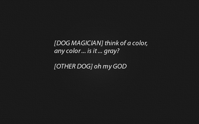
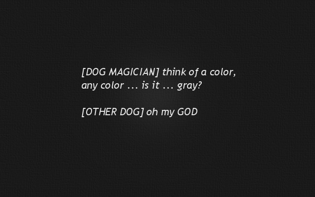
Thinking that I wanted a Lucida version, I adjusted the font size and x/y coordinates until I got what I thought was the best image. The following images show the iterations I worked through:
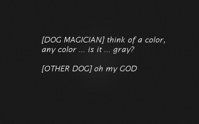
Note that after this first image it occurred to me that the joke is about seeing shades of gray. At this point I changed the font color from about 98% white to about 92% white, making it appear more gray. A lot of people might not notice this consciously, but I thought it was better:
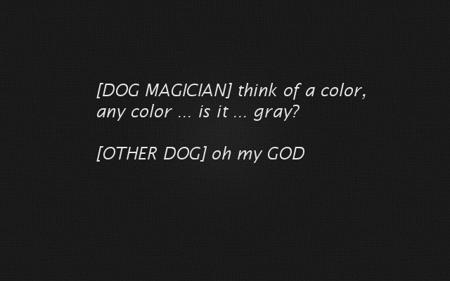
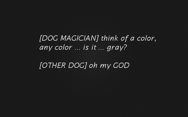


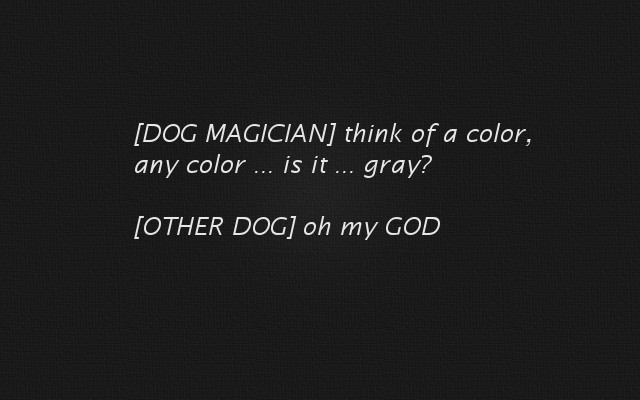
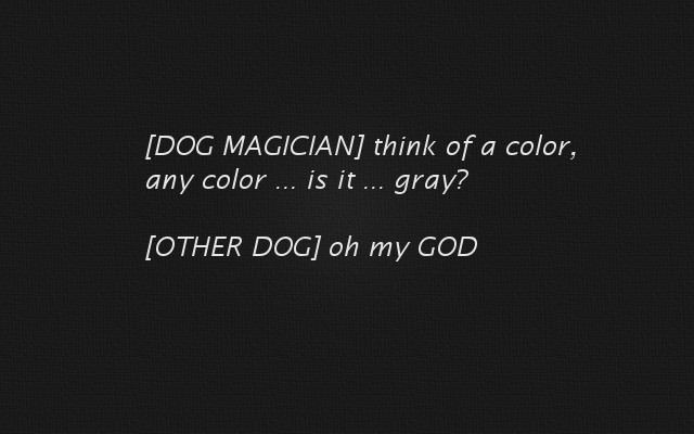

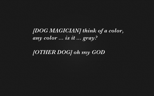
I know it’s hard to see any difference between those images online, but if you load them into Preview (or Acrobat) and then scroll through them, I think you’ll agree that one of the last two images is better than the earlier images.
(Note: As I look at these images now, it looks like the text needs to be moved to the left a little more.)
Design “lessons learned”
I hope you can see from this example one thing that I really believe about design:
Quantity leads to quality
Even though this was for a trivial Facebook post, if I had gone with one of my first ideas it wouldn’t have looked nearly as nice as the final version.
Because quantity leads to quality, this leads to a second important rule about good design:
You need to be able to iterate between designs fast
For this example I was able to create about 25 different versions of this image in about 30 minutes. If I could only create three images in 30 minutes, I would have never gotten to the final version, so iteration speed is very important. Or, looking at it another way, if I had been able to knock out 200 versions in 30 minutes, I could have gotten something better, perhaps by using more than one font, trying different colors, background images, “clouds,” silhouettes, changing the vertical font spacing, kerning, etc.
Related
If you enjoyed this article, you might like my related article, How to design products you love.
books by alvin
 |
 |
 |
 |