Posts in the “design” category

Inkscape

I use Gimp to work on images all the time, but I was just reminded of Inkscape as a free tool for drawing and illustrating.

Dieter Rams ten design principles

Dieter Rams Ten Design Principles: Recently I wrote about Jonathan Ive design interview quotes, and if you're familiar with industrial design and Apple design, you know you can't mention Jonathan Ive without also mentioning Dieter Rams, a world famous designer for Braun.

(If you don't know why I say that you can't think of Apple or Jonathan Ive without thinking of Dieter Rams, this Gizmodo article shows the amazing comparisons between Mr. Rams' designs and current Apple products.)

Dieter Rams 10 design principles (commandments)

So, to give Dieter Rams a little honor and credit -- both for his work at Braun and the evolution of his work at Apple — here are the famous "Dieter Rams 10 Design Principles":

  • Good design is innovative
  • Good design makes a product useful
  • Good design is aesthetic
  • Good design makes a product understandable
  • Good design is unobtrusive
  • Good design is honest
  • Good design is long-lasting
  • Good design is thorough down to the last detail
  • Good design is environmentally friendly
  • Good design is as little design as possible

Tue, July 20, 2004 (The Non-Designers Design Book)

Have you ever had one of those mind-blowing experiences where you are really, really struggling with a problem ... struggling for hours, days, or weeks, and then suddenly - bam! - you find exactly what you need? I had that experience this morning, and it was truly awesome.

Chicago Cubs “oilified” image

I just ran across this image. I created it way back when I was first learning how to create artistic effects with Gimp. I don’t know for sure because I didn’t save the working file, but I suspect that I created this image by starting with an image from a YouTube video, then blurred it a little bit, then applied the “oilify” effect to it one or more times.

P.S. — If you’re old enough, you can identify the pitcher and the batter, despite the Gimp artistic effects. :)

Designers choosing form over function

One of my gripes with both MacOS and Ubuntu is that it’s harder than it needs to be to grab a window corner or edge to resize it. IMHO, designers are choosing form over function.

What can a budget iPhone design look like?

A "budget" iPhone prototype design from Nickolay Lamm. According to this page (where the photo/prototype is from), Mr. Lamm is fascinated with trends in the technology and business world, often illustrating these interests in illustrations. He graduated the University of Pittsburgh’s College of Business Administration in 2011 and his life goal is to create a startup which changes the world.

XO Play lesson: Game perspective is important

One thing I learned last night about my XO Play football game is that even in a “thinking man’s game” like this, visual perspective is important. I thought I would like the game as I showed it yesteday, as if you were looking at it from a coordinator’s box or sideline seat, but even though this image is a poor mockup and the perspective isn’t great, I like it better. (And of course now this makes me want to show real players (with depth) instead of Xs and Os.)

“Grid by Example” website

As the Grid by Example website states, it provides “a collection of usage examples for the CSS Grid Layout specification.” Importantly, the Browsers tab on the website discusses current support for the spec in different browsers.

How to redesign the Twitter user interface (UI)

Twitter UI redesign: After using Twitter for the last several months, it seems like their user interface is out of sync with how I want to use their data. As I was waiting for dinner to cook last night I spent a few minutes thinking about the Twitter user interface (UI) and how I might redesign it. Here are my thoughts.

The current Twitter web interface

The things the Twitter web interface does well currently are:

Lean UX

I saw yesterday that the book Lean UX won an award (a Jolt award for productivity, I think), so I started reading it last night. I thought the following passage was an excellent description of the process, and of design in general:

CSS even/odd row selectors (zebra striping)

As a quick CSS note, if you want to achieve a “zebra striping” style with even and odd CSS row selectors, CSS styles like this will get the job done:

.path-frontpage .content-inner-right .content-type-Text:nth-child(even) {
    /* yellow */
    background-color: #fdfdf6;
}

.path-frontpage .content-inner-right .content-type-Text:nth-child(odd) {
    /* blue */
    background-color: #f3fbff;
}

I use that CSS for the front page of this website, but if you want a simpler example, here you go:

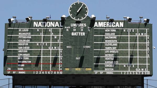
Wrigley Field wall clock

After watching a replay of a Chicago Cubs' game recently I noticed the clock over the scoreboard:

After seeing that, I thought, “How cool would it be to have a clock like that at home?” After a quick search I found that someone on Cafepress already had the same idea, but a poor design:

Making this website easier to read

The design of this website has been bothering me almost since I switched to it. The biggest problem was that all of the blocks I had on the side, especially the tall ad block, made the content hard to read.

So this weekend I finally took the time to change it, and Goal #1 was to make blog posts like this one easier to read. As a result, I switched to a simple (and somewhat drastic) approach of a one-column design.

Jonathan Ive - Objectified video (and quotes on design)

A great video where Jonathan Ive talks about design, and Apple products:

Jonathan Ive design quotes

Some of the great quotes from Mr. Ive during the interview process:

A designer ... it's the way you look at the world ... you're constantly looking at something and thinking, "Why is it like that? Why is it like that, and not like this?"