Twitter UI redesign: After using Twitter for the last several months, it seems like their user interface is out of sync with how I want to use their data. As I was waiting for dinner to cook last night I spent a few minutes thinking about the Twitter user interface (UI) and how I might redesign it. Here are my thoughts.
Note: I originally wrote this blog post in March, 2011, and five years later I still think it’s better than the current Twitter UI, which hasn’t changed significantly since then.
The current Twitter web interface
The things the Twitter web interface does well currently are:
- They make tweets of all the people I follow easy to see.
- They display trends.
- They display suggestions for new people to follow.
A major thing they do wrong is that they make it hard for me to see what I really want to see: My custom lists and searches. They’re there, they’re just not obvious.
You really notice this problem when you try to follow a lot of interesting people. With 1,000 or more messages a day, it’s very easy to miss good, interesting tweets from people you follow. The UI needs to give you a way to easily sift through the crap/noise to help you find the good stuff.
A nice feature here would be if I could easily sort tweets from people I follow by how often other people have “liked” them. A power-user feature like, “Show me all tweets from people I follow in the last 24 hours that have been liked at least 20 times.” Shoot, I don’t even know if that’s a power-user feature as much as it is a way to sort the data.
And finally, as one huge design flaw, the nicest thing you can say is that they make it very difficult to try to follow a series of tweets in reply to each other — back and forth tweets that are essentially “conversations.”
How to redesign the Twitter user interface
The basic features an experienced Twitter user wants is fast access to these items:
- See tweets from all people they follow (preferably with a way to filter them)
- Their custom lists
- Their saved searches
- Their saved tags
It’s a no-brainer to let user customize the product to give them a feeling of ownership in the product.
Depending on who they are and how they use Twitter, they may also want to see:
- Favorites
- Retweets
- Messages
- Follow suggestions
- Trends
These items also should be easy to access:
- Create a new tweet
- Search
If you’re familiar with software requirements and design you’ll know these bullet items are Use Cases (or User Stories, if you prefer), and the sorted order can simply be stated as views the user wants to see most often, or if you want to be fancy you can use Six Sigma Design to get to the same place.
Twitter UI redesign: The navigation interface
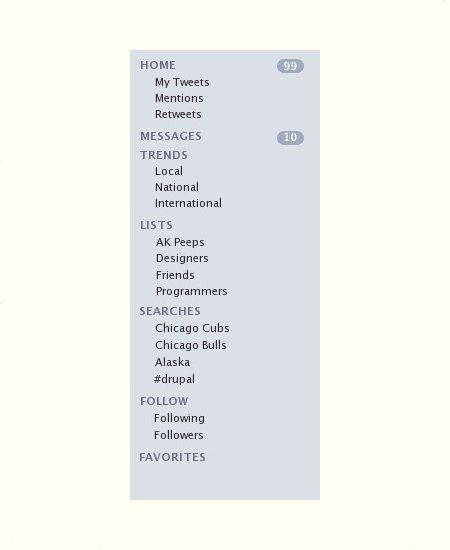
IMHO, the best UI design approach we have today to solve this problem is the list interface currently used in Apple products like iTunes. (Note: This UI approach was first made popular by other applications, including Microsoft Outlook, where it was more of an "accordion" style.)
Since a picture is worth 1,000 words, I won't waste time trying to describe my Twitter UI design, I'll just share the navigation element here:

Twitter Navigation Panel
I mocked up this Twitter navigation panel using the iTunes colors and fonts, but of course the actual interface can be whatever colors, fonts, and icons a designer deems worthy. (Brighter would certainly be better.)
Here's a quick discussion of this Twitter navigation panel:
Advantages
Advantages of this UI redesign are:
- One click access to everything you use regularly.
- The obviousness of everything. For instance, it can serve as a reminder that "Oh, I have these saved searches and lists."
Additions
There are also things I would add to this UI redesign prototype that I don't have time to spend on, including:
- I'd probably add some icons to make it look better (see iTunes).
- I'd add a "+" icon to each category to make it easy to add new items.
Other Notes
I also don't care to take time to get into the rest of my Twitter UI Redesign, but here are a few other notes:
- The HOME link would show the list of tweets from all people you follow.
- I'd still keep current trends somewhere on the main display.
- Likewise I'd keep "follow" suggestions somewhere on the main display.
- I'd spend some quality time on "conversations" between users. Apps like Google Wave and others have shown how the UI can be handled.
- The ability to post new tweets and search would also still be available from the HOME screen and most other views.
Twitter UI redesign: Summary
I don't know why the people at Twitter haven't redesigned their site. I'm sure they're trying to keep it simple, but it's one thing to be simple for newbies, and another thing to oversimplify to the point that your product isn't as good as it can be.
Put another way -- if everyone in the world had access to Twitter data, and you could use another website besides Twitter on a regular basis, do you really think the current website is the best possible user interface?
I always wonder what keeps people from doing "the right thing" and fixing their UI. The people at Twitter are obviously bright people, so I have to think a) they think it's better to be overly simple, b) they're more concerned about other things (how to make money), c) they don't have enough resources (not likely), d) they're afraid to make a change and sink the ship like Digg did, e) they think they have some data that tells them their current design is the best approach.
In my case, the reasons I don't spend more time on the UI of my websites is a) not enough manpower, b) trying to figure out how to generate more revenue on the websites without making the ads any worse than they already are, so I can certainly understand those problems.
Finally, there are certainly ways not to sink the ship like Digg did with their UI redesign, so, in closing, I hope Twitter will come out with a new user interface like this at some point.


