iPhone HTML page size FAQ: In an HTML web app optimized for the iPhone, how do I set the page size to be the optimal iPhone page size (iPhone page pixel width)?
By default the iPhone assumes HTML pages are 980 pixels wide. When you're creating a custom iPhone HTML app, you really want to control this page size so your web app will look better.
The way you change the iPhone HTML page size (pixel width) is to use the special iPhone HTML "viewport" meta tag, like this:
<meta name="viewport"
      content="user-scalable=no,width=device-width" />
This is a special iPhone meta tag, and when applied to a simple HTML web page, it has the effect of making the iPhone Safari web browser zoom in on your web page to make the text larger and easier to read, and your hyperlinks easier to tap.
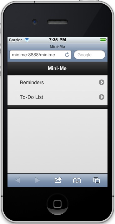
iPhone HTML page width (pixel width) - Screenshot
Unfortunately I don't have both before and after iPhone screenshots, but this screenshot from an iPhone HTML app will give you an idea of the page size after this iPhone meta tag has been added to the HTML of your web page:

This photo is from a recent iPhone HTML/web app I developed, and as you can see, the text size seems appropriately scaled for the iPhone. A major part of this is from setting the iPhone viewport using the meta tag shown above.
iPhone HTML web page size (pixel width) - Summary
I hope this short example on how to set your HTML page width (pixel width) for your HTML iPhone apps has been helpful. For more information on developing iPhone/iPad HTML applications, here's a link to Apple's developer documentation on configuring web applications.


